The Story Behind
Our Logo
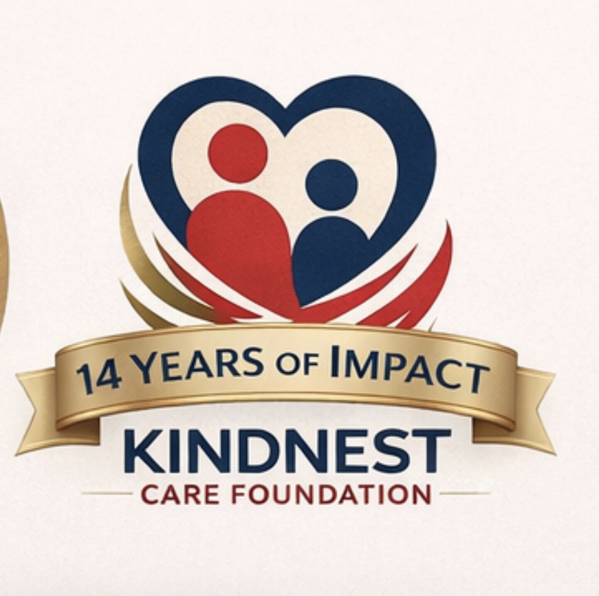
Every line, colour, and curve in the KindNest Care Foundation logo carries meaning. Discover the visual language that represents our mission of care, unity, and global compassion.
A logo is never just a graphic — it is a promise. For KindNest Care Foundation, our logo is the visual distillation of everything we stand for: compassion without borders, safety for the vulnerable, and the unbreakable strength of community. Here is a deep dive into every element of our identity mark.
A Symbol That Speaks Before Words Do
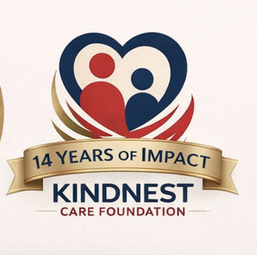
The KindNest Care Foundation logo is a powerful and emotionally resonant design that communicates care, unity, and global compassion through deliberate visual symbolism. Every single element has been considered — nothing is decorative for decoration's sake alone.
When people see our mark for the first time, they sense something before they read anything. That instinctive emotional response — warmth, safety, belonging — is exactly what our founders envisioned when the identity was first conceived.
The Heart
At the top of the composition, a heart outline represents love, empathy, and humanity — the foundational principles of any true humanitarian organisation.
The Two Figures
Inside the heart, two abstract human figures — one red, one deep blue — represent diversity, inclusivity, and the care we extend to all people, without exception.
The Nest
Curved red lines at the base form a stylised nest, symbolising safety, nurturing, and home. The nest cradles the figures, reinforcing our mission to protect the vulnerable.
The Unity
Together, the figures evoke companionship, mutual support, and shared protection — mirroring the communities we work within and the partnerships we depend on.
Love at the Core of Everything
The heart is universally understood as a symbol of love, care, and empathy. Placing it at the very top of our icon composition was a deliberate choice: everything flows from love. Every programme we run, every community we enter, every child we support — it all begins here.
Crucially, the heart is rendered as an outline — open, not filled. This openness is intentional. We are not a closed system. Our arms, our homes, and our hearts remain open to all who need us.
The open heart is not just a design choice — it is our operating principle. We do not close our doors to those in need.
— KindNest Care Foundation, Founding Vision

Diversity, Companionship, and Mutual Protection
Nestled inside the heart are two abstract human figures: one rendered in our signature red, the other in deep navy blue. These two figures represent the breadth of humanity that we serve and stand alongside.
Their abstract nature is meaningful. They are not one specific gender, ethnicity, or background — they are everyone. The diversity within our organisation and the communities we serve is a strength we celebrate, not a complexity we manage.
The physical closeness of the figures — the way they lean toward each other within the heart — communicates companionship. We do not provide aid from a distance. We stand beside the people we serve, and we stay.

-
1Inclusivity We serve all people, regardless of background, identity, or circumstance.
-
2Companionship We do not stand apart from those we serve — we stand with them.
-
3Mutual Protection Care flows both ways. We learn from every community we enter.
-
4Humanity First Every decision is filtered through a lens of human dignity and respect.
Safety, Nurturing, and the Meaning of Home
Perhaps the most distinctive element of our logo is the nest at the bottom of the composition. Formed by graceful, curved red lines, the nest is where the name KindNest finds its visual life.
A nest is one of nature's most instinctive symbols of safety, warmth, and preparation. Birds build nests not just for shelter, but for new beginnings. In the same spirit, KindNest Care Foundation exists to give vulnerable individuals and communities the safe, stable environment from which they can grow.
The nest appears to cradle the two human figures above it, visually reinforcing our mission: we catch people. We hold them. We give them a foundation from which to rise.


Words That Carry Weight
The typography in our logo is as considered as the iconography. Font choice communicates personality — and we chose ours with great care.
The contrast between the two typeface weights creates a natural hierarchy: KindNest is the name — bold, anchored, remembered. "Care Foundation" provides context and amplifies the emotional tone with its red colour. Together, they communicate both reliability and passion.
Three Colours, One Complete Message
Colour is among the most powerful tools in visual communication. Our three-colour palette was chosen not for aesthetics alone, but for the distinct psychological and emotional messages each shade carries.
Red is the colour of urgency and heart — it demands attention while communicating warmth. In our context, it speaks to the immediacy of need and the passion with which we respond to it.
Deep Blue grounds the identity. It is the colour of trusted institutions — of the sky and the sea, of calm in the midst of difficulty. Our navy blue says: we are steady. We will not waver.
White provides the breathing room that allows both red and navy to shine. It communicates transparency, openness, and clarity — all qualities we hold as organisational values.

Where Visual Clarity Meets Emotional Depth
Taken together, every element of the KindNest Care Foundation logo works in concert to communicate something that words alone struggle to express: that there is a place where people are safe, loved, and never alone.
-
✦A Global & Inclusive Mission The abstract figures represent every person on earth — no one is outside the scope of our care.
-
✦A Safe, Nurturing Environment The nest at the base of our icon is both literal and metaphorical — a cradle for the vulnerable.
-
✦Human-Centred Care The heart and figures at the centre place people — not processes or profits — at the heart of all we do.
-
✦A Modern, Professional Identity Clean typography and a focused palette ensure we are taken seriously as a credible humanitarian organisation.
This logo is an ideal blend of visual clarity and emotional depth — perfectly suited for an organisation that changes lives.
— Brand Design Review, KindNest Care Foundation
 KindNest Care Foundation